Coffee isn’t just a beverage; it’s a daily ritual, an affordable luxury, and for many, a passionate pursuit. Your label is the gateway to that experience, and in today’s crowded market, it has mere seconds to grab attention and convince someone to choose YOUR coffee.
The Power of Coffee Packaging : Your label is a powerful marketing tool. It needs to:
- Stand Out Visually: Amidst a sea of coffee bags or jars, yours has to instantly catch the eye and pique curiosity.
- Tell Your Brand Story: Is your coffee focused on single-origin beans, playful flavor combinations, or sustainability? The label design should be the first taste of this.
- Influence Purchase Decisions: Ultimately, even the most beautiful label needs to close the deal and make a coffee lover put your product in their basket.
The world of coffee enthusiasts is vast! From the casual drinker seeking a reliable morning brew to the discerning connoisseur exploring rare beans, there’s no single “right” design. Great coffee label design finds that sweet spot where it appeals broadly enough to sell, while still feeling unique enough to justify a premium price.
Let’s dive into how to design a coffee label that entices new customers and builds lasting brand loyalty!
1. Key Elements of Coffee Label Design
While every coffee label should be distinctive, these core elements work together to influence perception and guide purchasing decisions:
Logo & Brand Name
- Placement: Must be visible, but doesn’t always have to be front and center. Consider how it works with other elements on the label.
- Hierarchy: What’s more prominent, the brand or the specific coffee? This hints at your overall brand strategy.
- Style Choices: Serif = traditional, sans-serif = modern, script = artisanal. Font choices should embody your brand’s personality.
Coffee Type & Name
- Easy to Find: Don’t frustrate customers with a scavenger hunt for basic info. Clear labeling builds trust at a glance.
- Readability: Font size AND style. Overly decorative fonts are a no-no, especially with longer coffee names.
- Hints at Flavor: Bold design for dark roasts, softer colors/illustrations for lighter roasts, playful for flavored blends.
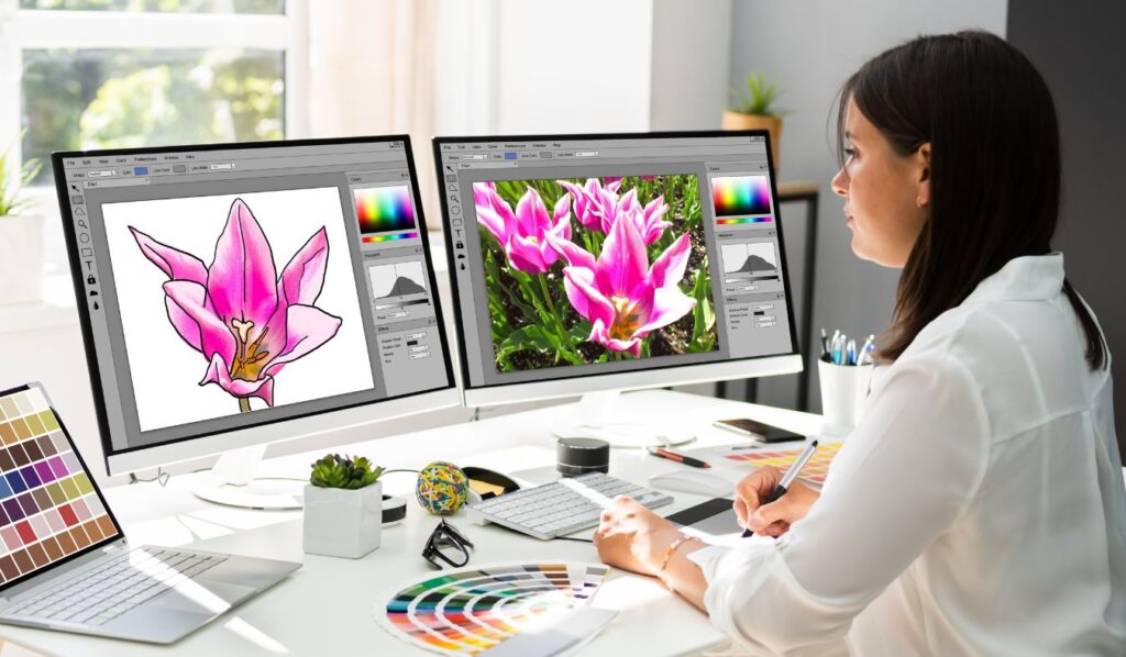
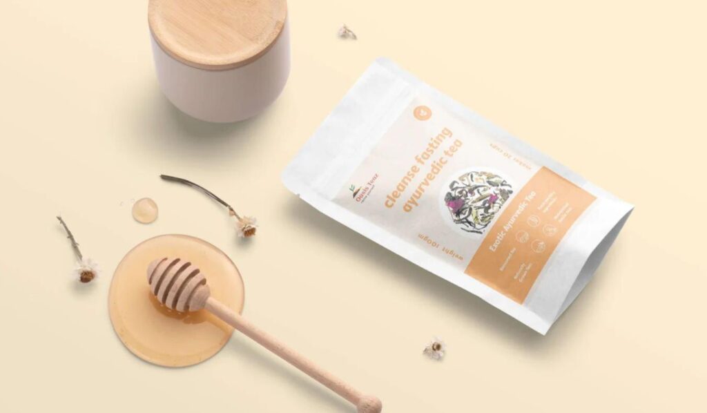
Imagery
- Photos: High-quality shots of whole beans, a beautiful pour-over, or even the region of origin evoke a sense of quality.
- Illustrations: Can be artistic, whimsical, or infographic in style. Work well for brands with a distinct personality.
- Abstract Patterns: Modern appeal, but ensure they support the overall tone, not compete with essential information.
Color Palette
- Classic Combos: Browns, blacks, creams are immediately recognizable as “coffee” but risk being forgettable.
- Bold Pops: Unexpected color accents (think a vibrant turquoise) catch the eye, but must align with the brand, not feel jarring.
- Shelf Impact: Always consider how your label appears within the context of the store environment and competitors.
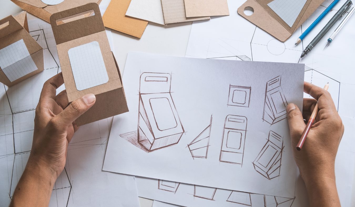
Texture & Shape
- Materials Matter: Kraft paper signals eco-friendly, glossy feels more upscale. Align with brand and price point.
- Shape: Standard rectangles are cost-effective, but circles, ovals, or custom cuts can make a statement (assuming your packaging allows).
2. Inspiration for Your Coffee Label
Finding your unique design voice starts with thoughtful research and a touch of creative experimentation. Consider these avenues:
Target Audience Research
- Who’s Your Ideal Customer? A budget-conscious college student vs. a buyer for a luxury spa will respond to vastly different label designs.
- Lifestyle & Values: Does your target audience prioritize single-origin beans, fun flavor experiments, or sustainable sourcing? Design reflects this.
- Where’s it Sold? A grocery store aisle demands a different approach than a curated online boutique for coffee lovers.
Trends vs. Timeless
- Analyze the Trend: Look at current coffee label trends – are there colors, typography, or illustration styles that keep popping up?
- Longevity: Avoid chasing fads that will quickly make your label look dated. Balance freshness with enduring appeal.
- Classic with a Twist: Sometimes updating a single element (a bold color on a traditional label) is the most effective way to stand out.
Competitor Analysis
- Map the Territory: Carefully examine coffee brands within your similar price point and target market.
- Don’t Copy: The goal is to identify gaps you can fill or common design tropes to subvert in order to differentiate yourself.
- Look Beyond Coffee: Inspiration can come from anywhere – chocolate bar packaging, liquor labels, even interior design trends.
Mood Boards
- The Power of Visuals: Gather images, color swatches, font samples, and anything else that evokes the feeling you want your coffee to inspire (cozy, energizing, sophisticated, etc.).
- Digital or Physical: Tools like Pinterest are great, but there’s something tactile about a physical mood board you can rearrange and refine.
- Share & Iterate: Get feedback from potential customers or a design-minded friend to refine your vision before diving into label creation.
3. Practical Considerations
Brilliant design means nothing if it can’t be executed well and within your budget constraints. Consider these factors carefully:
Label Size & Shape
- The Container is King: Your label design must be tailored to your chosen coffee packaging. A design that works on a tall pouch might look awkward on a squat jar.
- Maximize Usable Space: Account for how the label wraps around, seams if present, or if there are multiple sides to design for (back, bottom, etc.).
- Unusual Shapes = Cost Considerations: While visually striking, complex die-cuts or very large labels increase complexity and price, which needs to align with your pricing strategy.
Material Options
- Paper Versatility: From simple matte to textured or metallic finishes, paper offers a wide range at various price points.
- Glossy = Modern: Great for photos and bright colors, but fingerprints show easily if your coffee will be handled a lot.
- Textured = Artisanal: Kraft paper is popular for its natural feel, but needs bold design to ensure readability.
- Durability: Where will your coffee be stored? Moisture resistance is key for beans sold in humid climates, or if intended for outdoor use (think camping).
Printing Methods
- Digital: Good for smaller runs, quick turnaround, and the ability to easily personalize labels (think limited edition flavors).
- Flexographic: Often more cost-effective for high volume, wider range of specialty inks and materials (spot gloss, metallics, etc.).
- Other Options: Letterpress, foil stamping, etc., create a boutique feel but significantly increase production costs.
Legal Requirements
- The Non-Negotiable: Unfortunately, the most visually stunning label is useless if it gets your product pulled from shelves for non-compliance.
- Location Matters: Required information, font size regulations, etc., vary between countries and regions.
- Research is Key: Relevant government websites (FDA, etc., for your target market) are the source of truth, not just what you see on competitors’ labels.
- Room for Legalese: Ensure the necessary legal info doesn’t ruin your design aesthetic – plan for it from the start, both in terms of placement and how much text space to allocate.
4. Design Resources
Ready to make your coffee label vision happen? These resources will help, regardless of your budget or design experience.
Free Design Tools
- Canva & Others: These platforms often offer pre-designed label templates, including ones with a coffee focus.
- Coffee Templates: Search terms like “coffee label template Canva” to narrow down the options and get a head start.
- Limitations: Risk of generic-looking labels if not heavily customized. May struggle with complex shapes or multi-part labels.
Stock Image Sites
- Coffee Storytelling: If you’re not using your own product photography, source high-quality stock images of coffee beans, brewing techniques, coffee-growing regions, etc.
- Popular Options: Unsplash, Pexels, Pixabay for free options. Shutterstock, iStock, etc., for paid (often wider selection of coffee-specific images).
- Licensing Matters: Ensure the image license allows for commercial use on your product packaging.
Coffee-Specific Inspiration
- Pinterest Power: Search “coffee packaging design” and similar terms. Create boards for mood boards or to track competitors.
- Niche Blogs: Many blogs focus on independent coffee roasters, cafe culture, or coffee reviews – these often feature standout packaging design.
- Awards: Sites like The Dieline and others showcase packaging design awards. Filter to their “Coffee” category for innovative ideas.
Finding a Designer
- When to Outsource: If you lack the design skills, time, or need highly custom results, hiring a pro is a smart investment.
- Portfolio is Key: Look for designers who have created beautiful AND functional coffee labels successfully (ideally in a style that aligns with your brand).
- Coffee Expertise a Bonus: If they understand the nuances of the coffee market, that’ll streamline the design process and ensure industry trends are leveraged effectively.
- Communication: Do their work style and responsiveness mesh with your own? Design is a collaborative process, even when outsourcing.
Need Expert Help ?
Designing the perfect coffee label requires both strategic thinking and a discerning eye for detail. If you’d like personalized support to elevate your coffee packaging, Contact Brand Sewa for a Free Label Design Consultation & Quote
Let’s work together to create a coffee label that beautifully reflects your brand and entices coffee lovers to choose your blends!
